This is a group project about visualising a set of data and bringing it into an infographic poster.
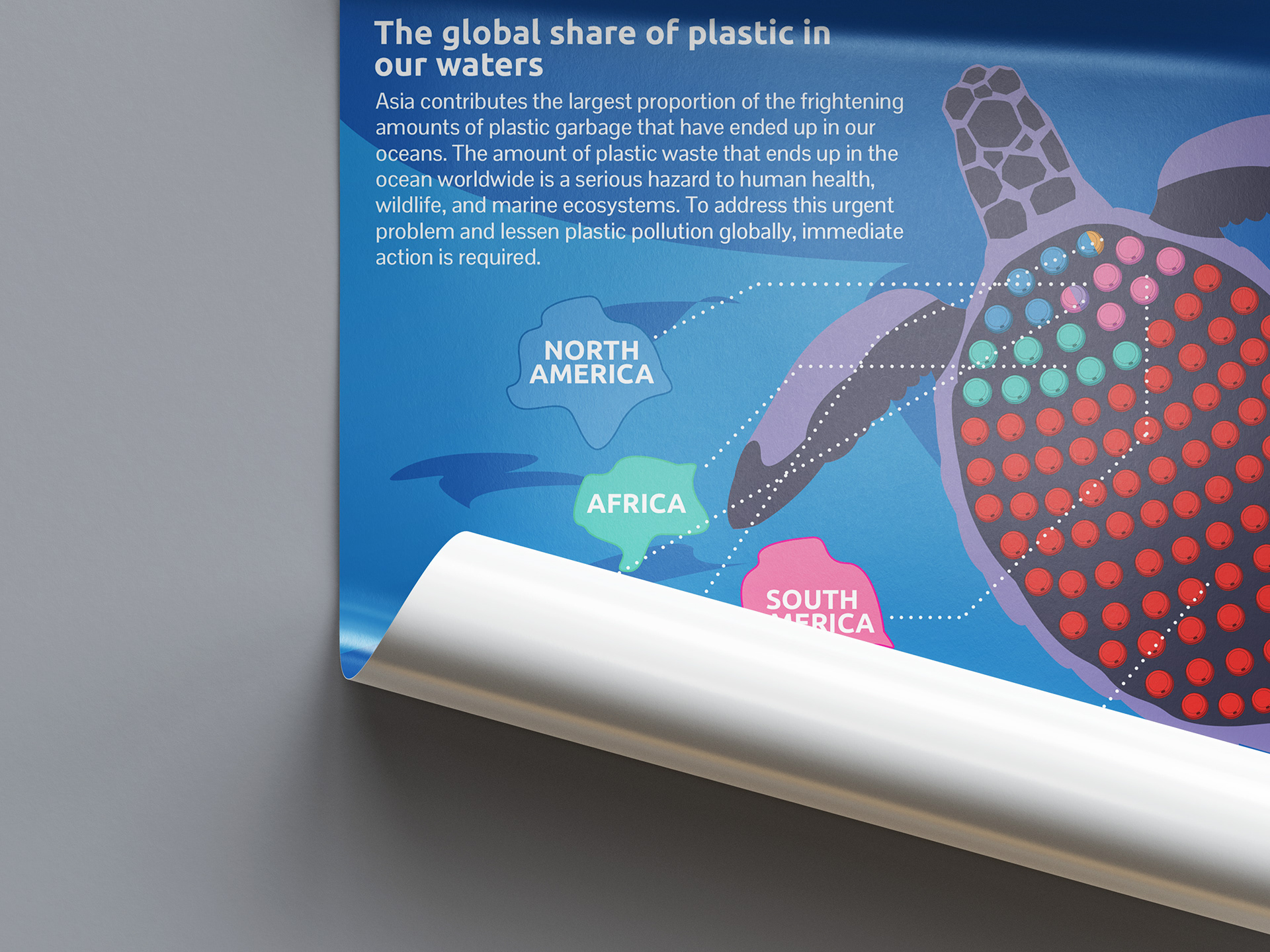
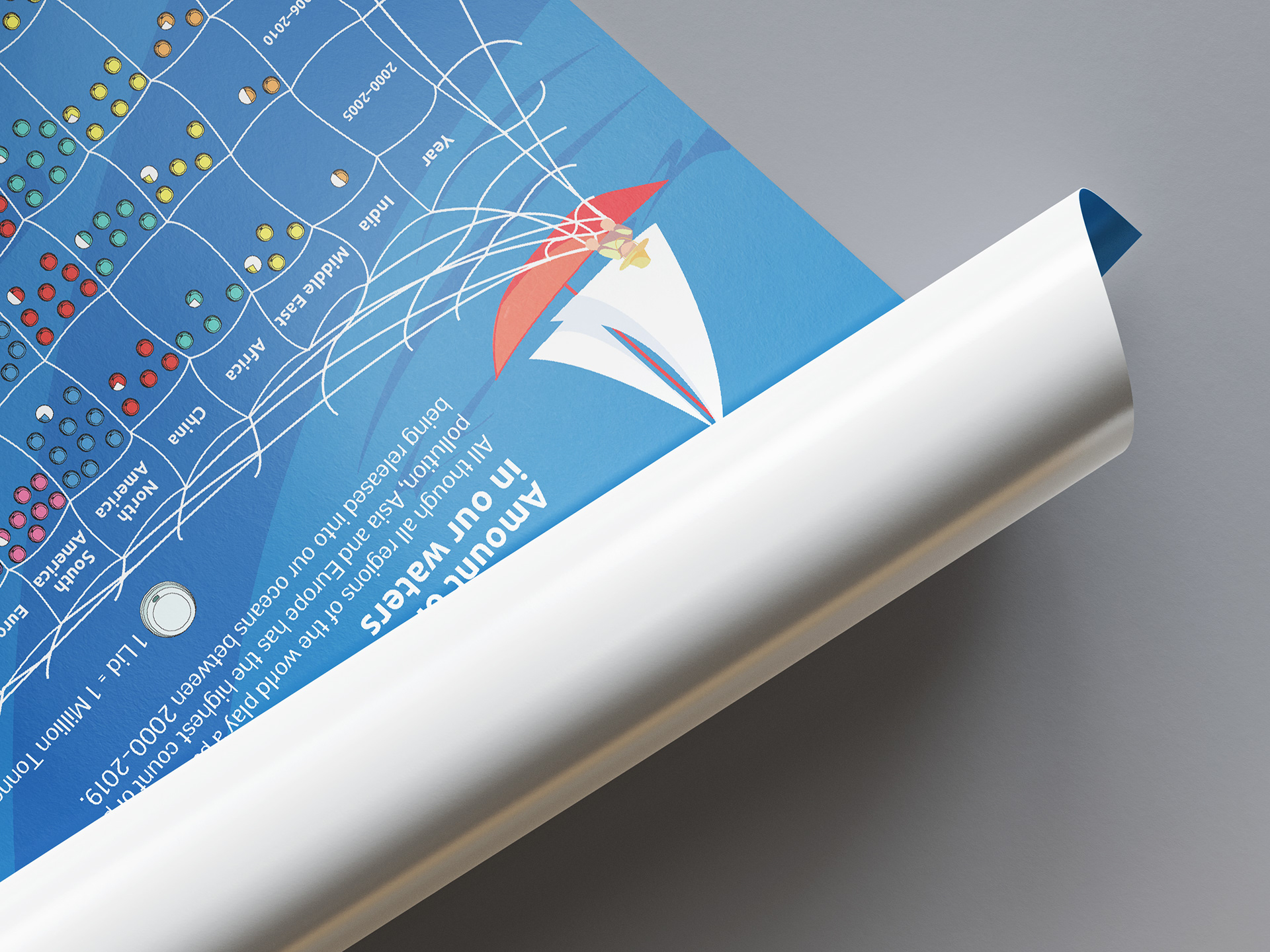
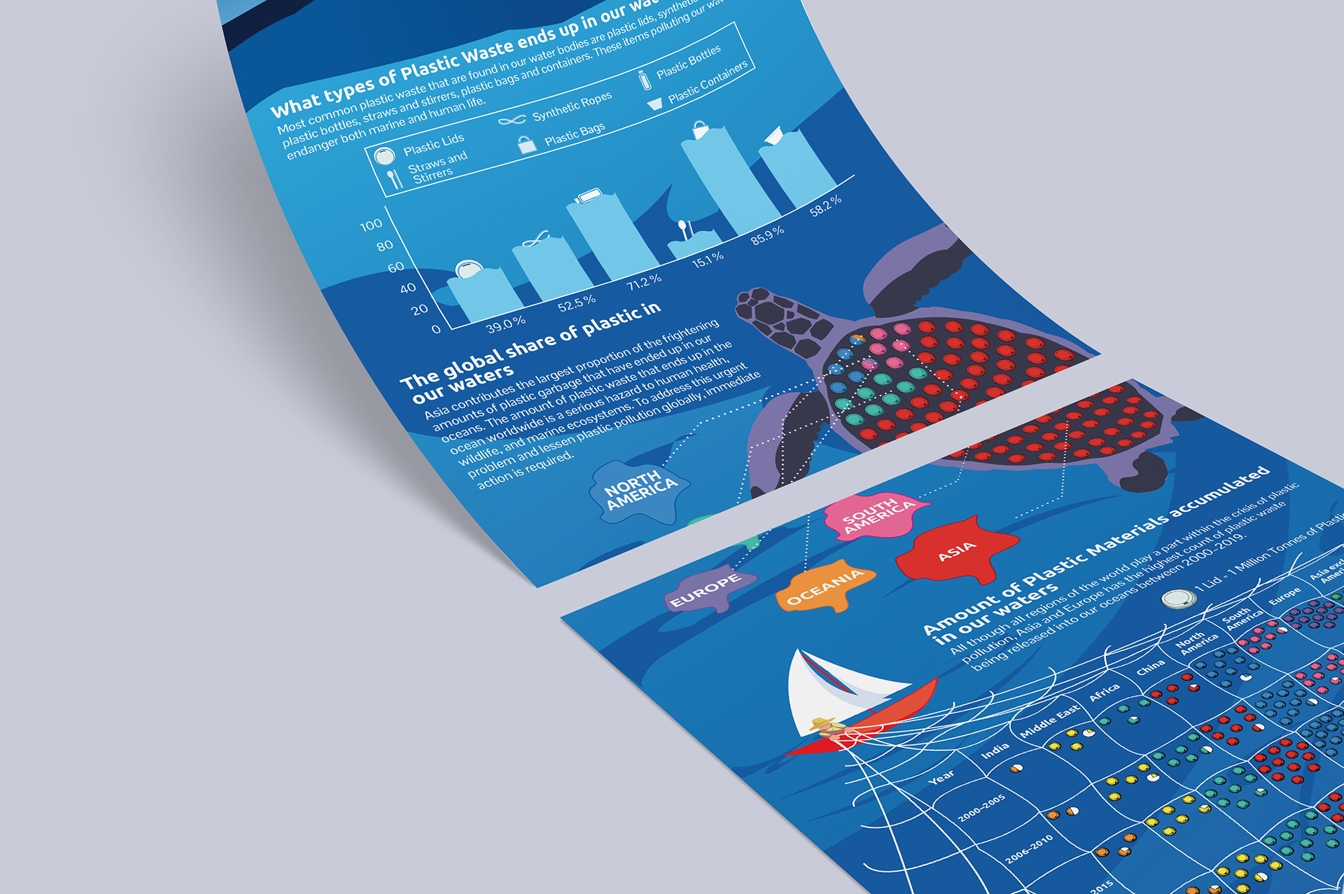
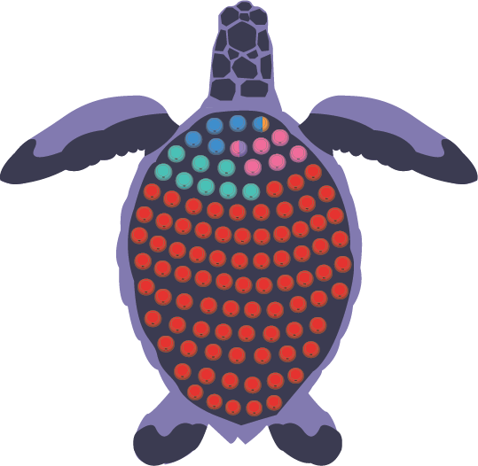
My role in this project is to visualise the amounts of garbage that have ended up in our oceans, which is the hero graphic of this poster, the turtle. The way to present the data is to use the lid to represent the percentage, and with the use of colours, I categorise the lids into different colours to represent different regions.